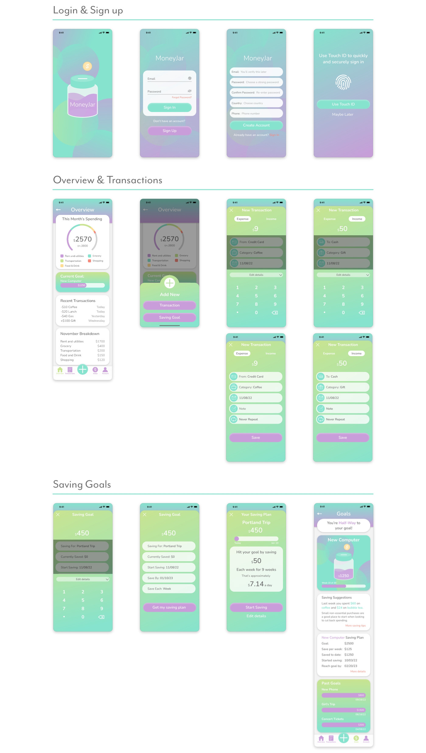
Overview
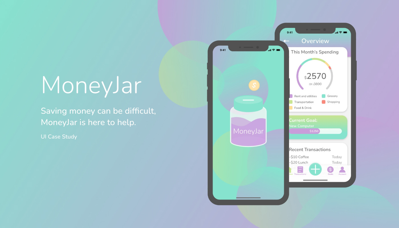
MoneyJar is a money-saving app aimed at people who want to save money for a particular reason within a span of time, designed in response to a student project brief. MoneyJar makes saving easier by offering users an easy way to keep track of their income and expenses while saving.
You don’t need to be a financial expert to save for your
next vacation.
Brand & Principles
Easy to Use Anywhere
MoneyJar offers easy financial tracking. Users can log expenses, income, budget and saving goals from anywhere.
Here to Help You Save
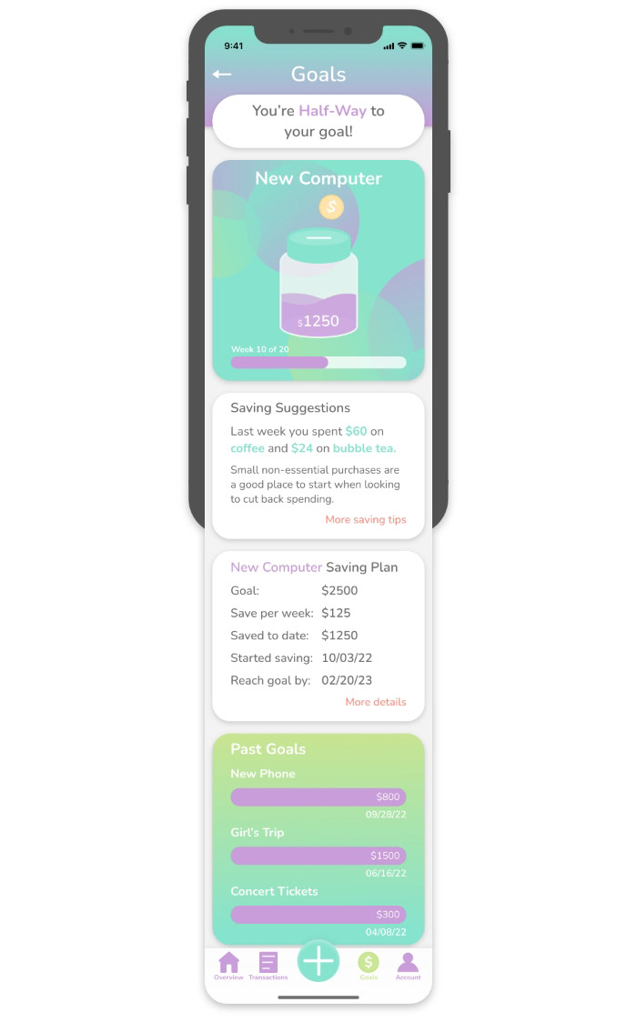
MoneyJar is here to help users reach their saving goals. With custom savings plans and visual representations of savings progress, MoneyJar encourages users to stay on track.
Safe and Secure
With MoneyJar’s secure login users can be sure that their information will stay private.
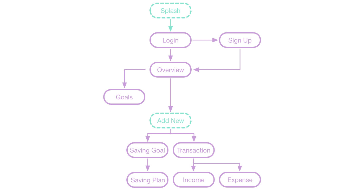
Userflow
As a user I want to...
• see a dashboard of my finances clearly and visually, so that I can see how much I am spending on what at a glance.
• see an overview of how much my finances have changed and how much I am saving throughout the saving period,
• so that I can stay on track.
• so that I can stay on track.
• be able to tell the tool what my savings goal is and how long I have to reach it, so that I can save accordingly.
• be able to input information on the money I am receiving and spending, so that I can see an overview of my finances.
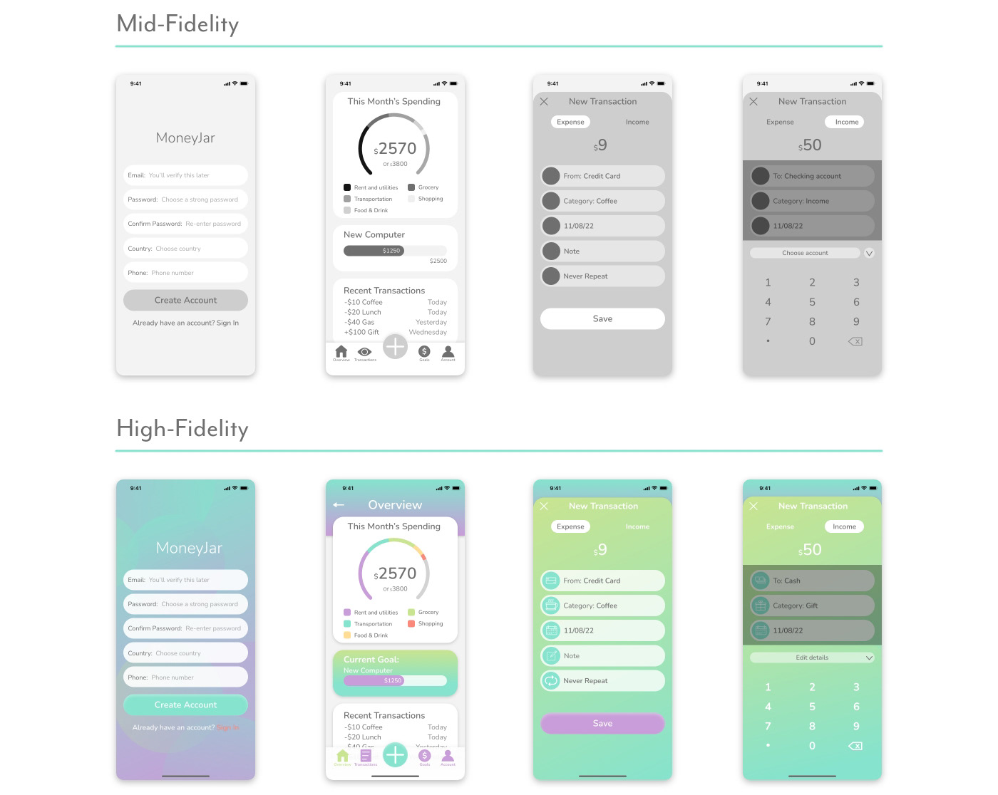
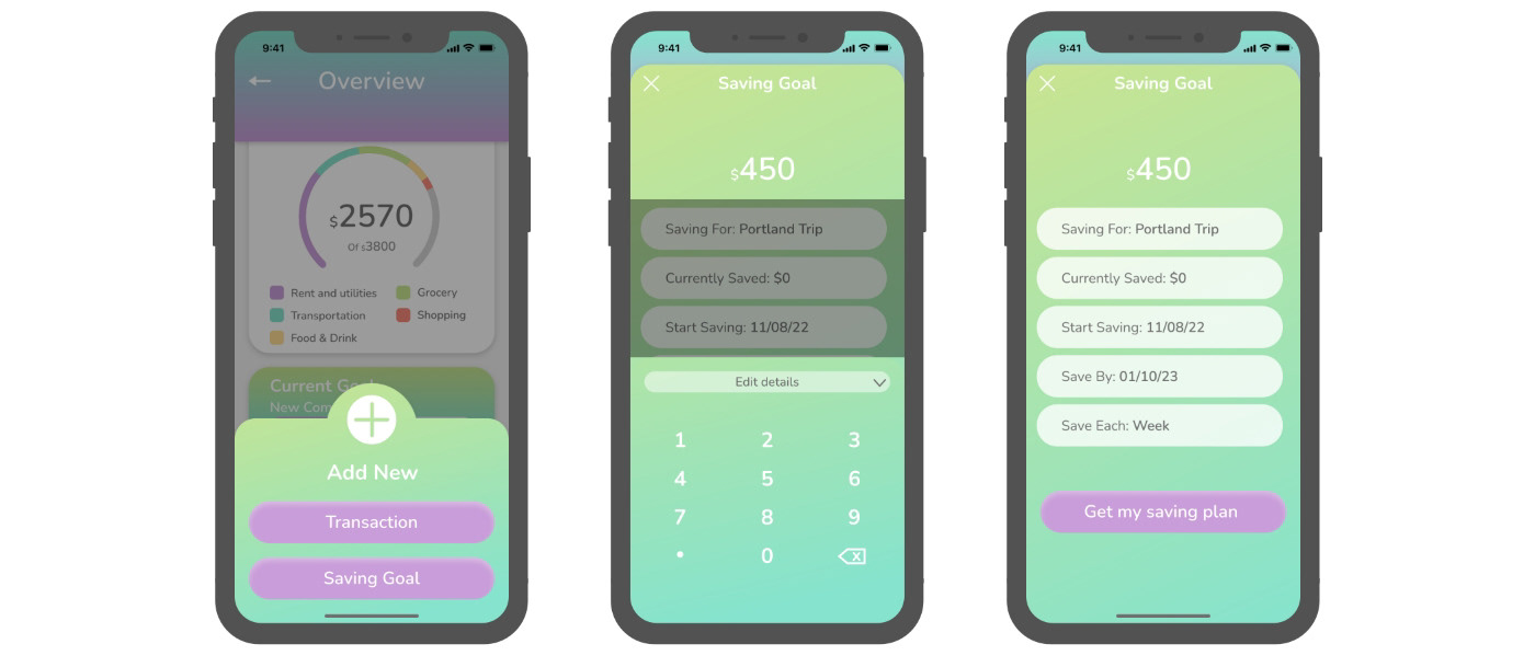
Wireframes
Style Guide
Logo
MoneyJar logo uses Nunito typeface. MoneyJar is always one word with ‘M’ and ‘J’ in upper-case and all other letters in lower-case. Logo uses light font weight at 40pt.

Colors & Typography
MoneyJar’s design takes inspiration from colors often associated with money and finance such as green and blue, and uses them in a fun and bright color palette to give a friendly and encouraging appeal.
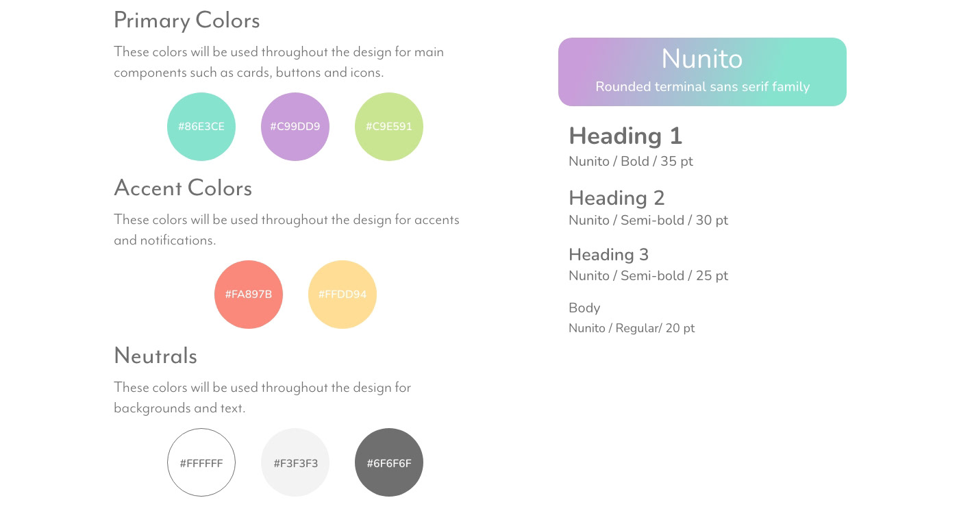
Imagery
MoneyJar’s design features a money jar illustration in various states that show the user’s saving progress. Illustrations are simple and use the established color palette. Icons will also follow similar style.

Writing Style
The voice of MoneyJar is friendly and approachable as well as encouraging and motivational. The writing style is clear and understandable without being overly technical. We want all users to be comfortable regardless of financial knowledge or experience.
User Testing
I conducted in person user tests with multiple participants. The participants used their own devices to access the prototype and were briefed on the the type of app it is, along with the scenario for the test and task to complete. After completing the task participants were also asked for their thoughts on the process and app overall.
Scenario
You are a new user who wants to wants to make
a new saving goal to save for an upcoming trip.
Task
Create a new saving goal for an upcoming trip.
Test Results
Overall the user test participants were able to understand how to complete the task with little difficulty. There were a few pain points identified during the testing.
Example Data
Some of the pre-filled data on the add screens was not clear in communicating examples of what would be entered in each field.
I changed some of the pre-filled information in the ‘to/from’ and ‘categories’ sections of the transactions screens to examples that are more clear. I also changed the wording to ‘edit details’ on the number pad pages to more clearly indicate a return to the edit page.
Touch Points
Several participants had trouble with some of the touch points being too small and difficult to tap.
When setting up the prototype I need to make some of the touch points larger than the icons themselves.
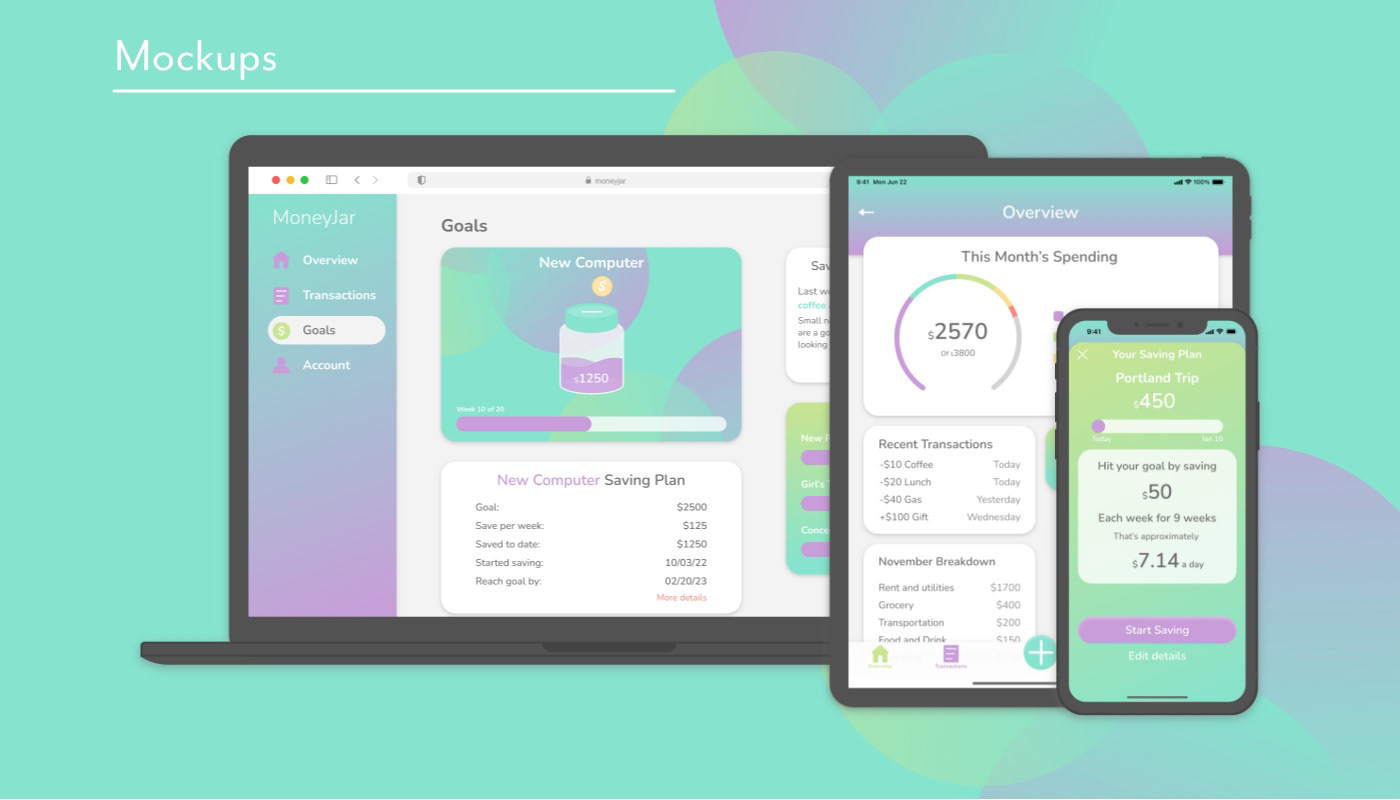
Final Designs